Robust JavaScript (HTML5) charting solution for easily adding interactive charts, maps and dashboards to web pages, apps
Technical articles and stack decisions from AnyChart
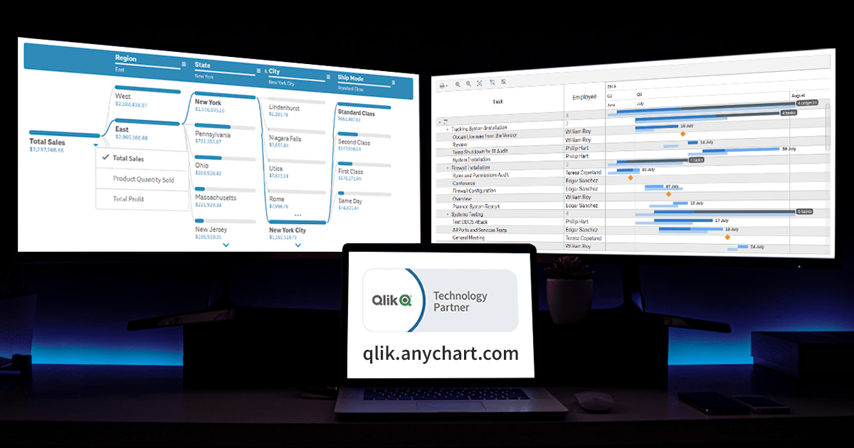
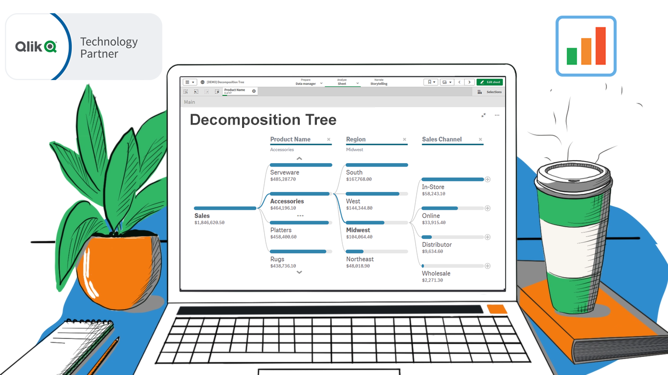
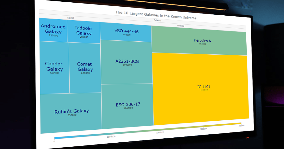
How to Create Decomposition Tree in Qlik Sense: Transform Root Cause Analysis [Video Tutorial]
An important note for Qlikkies: Are you ready to elevate your dashboards? Dive into our latest Qlik tutorial — discover the power of the Decomposition Tree and learn how to create it in Qlik Sense in about no time! Learn more and watch the tutorial at qlik.anychart.com »
Free Qlik Webinar: Qlik Sense Revolution — One Sheet Is Enough
Still burying insights under layers of charts? Master this powerhouse visual, enabling root cause analysis on a single sheet, and wow your business users!
Creating Calendar Charts with JavaScript
Master interactive Calendar Chart creation using JavaScript and explore four years of JS charting tutorials on the AnyChart blog.
AnyChart Triumphs Again: Awarded Best in Data Analytics and Visualization in 2024
AnyChart has won the prestigious 2024 DEVIES Awards in the Data Analytics & Visualization category, marking our victory for the 2nd consecutive year!
Introducing Updates to Waterfall Charts for Qlik Sense
Improved waterfall charts for Qlik Sense with valuable new features, further elevating visual data exploration. Learn about the latest updates & upgrade!
Qlik Webinar: Fewer Sheets, More Insights
Unlock the secret to crafting smaller yet more insightful dashboards your business users will love! Join our free webinar & elevate your Qlik Sense mastery.
Remembering 2023, Welcoming 2024
2023 was remarkable! Join us as we bid a final farewell to it by reflecting on its best moments for AnyChart. And Happy New Year!
How to Build Point Map with JavaScript
Master creating interactive point maps in JavaScript! Step-by-step guide using millionaire counts for global cities for illustration. Dive in now!
Unwrapping Enhanced Interactivity for Calendar and Circle Packing Charts in AnyChart 8.12.0
AnyChart 8.12.0 is here, the newest version of the JS charting library. Introducing interactivity events in Calendar & Circle Packing charts. Learn more!
How to Make Mekko Chart Using JavaScript
Learn what the Mekko chart is & how to create this visualization using JavaScript with ease. Illustrated by U.S. car sales data. Start your data viz engine!
OHLC Chart: Understanding & Creating in JavaScript Step-by-Step
The OHLC chart type is a pivotal financial data visualization tool. Find out more about it and learn how to quickly create such graphics using JavaScript.
Building Waterfall Charts in JS
Learn to make interactive waterfall charts in JavaScript with ease! Follow the visualization of Twitter's income statement step-by-step in the new tutorial.
How to Create Resource Chart with JavaScript
Learn to create interactive Resource Gantt Charts using JavaScript while visualizing the FIFA World Cup 2022 schedule step by step.
Nobel Laureates’ Countries, or Making Tag Cloud with JavaScript
Discover which country has the most Nobel Prize winners in an interactive tag cloud and learn how you can build your own JavaScript-based tag (word) clouds.
How to Build Pie Charts with JavaScript
Learn to effortlessly build cool interactive pie charts using JavaScript as we visualize the composition of the IPL winnership over 16 seasons step by step.
Elevated Data Control & Customization in AnyChart’s Latest Qlik Sense Extensions
New release! Discover new features enhancing data control and customization in our Qlik Sense extensions: Decomposition Tree, Gantt Chart, and more.
Stock Chart Creation in JavaScript: Step-by-Step Guide
Learn to create interactive stock charts with JavaScript using real data about Apple, Microsoft, and Google stock market prices over the past decade.
Meet YODA — Your Own Documents Assistant in Qlik Sense
Augment your dashboard with AI-driven insights from your documents! Try our newest Qlik Sense extension, YODA — Your Own Documents Assistant.
Creating Dynamic Linear Gauge for Real-Time Typing Speed Test Data Visualization: Using JavaScript
Need a linear gauge for your website? Learn how to quickly build one in JavaScript & see how it can be used for real-time typing speed test visualization.
William Dibbern Uses AnyChart JS Charts to Visualize Wedding Guest Data
Check out how data viz can add charm to personal milestones! Meet William, who used AnyChart JS to create a cool Bubble Map for his wedding website.
Join AnyChart at QlikWorld Tour 2023
Hop on QlikWorld Tour 2023 & be the first to meet YODA — Your Own Documents Assistant. Boost your data analytics in Qlik Sense with our extensions!
Building Bubble Chart with JavaScript
Learn how to create cool JS-based interactive bubble charts. Follow this illustrative tutorial visualizing data for the top 30 most-liked YouTube videos.
How to Visualize Data with Pareto Charts Using JavaScript
Learn how to easily create an interactive Pareto chart with JavaScript. We'll demonstrate the steps using customer complaints data. Check out the tutorial!
Freiheit Gruppe Uses AnyChart JS to Visually Organize Berliners’ Ideas for Berlin University Alliance
Discover the Berlin University Alliance's #Berlinforschtmit project and learn how AnyChart JS helps make sense of Berliners' ideas for new research topics.
Creating Decomposition Tree in Qlik Sense
Explore data ad-hoc and conduct root cause analysis like a boss with the Decomposition Tree in Qlik Sense. Learn how in this step-by-step tutorial!
How to Make Sunburst Chart in JavaScript
Learn sunburst charts and how to create these visualizations using JavaScript. Explore the birthplaces of Oscar winners for acting as an example.
How to Create Donut Chart Using JavaScript
Learn how to easily create an interactive donut chart using JavaScript, visualizing Roger Federer's Grand Slam title tally step by step. See the tutorial!
How to Build Heatmap in JavaScript
Master JS heatmaps in this tutorial! Learn as we visualize data on fatal road accidents in the U.S. step-by-step & spot the most dangerous time in heatmap.
MARVI Project Uses AnyChart Android Charts to Visualize Groundwater Data in MyWell App
See how AnyChart Android Charts empower MARVI's mission to revolutionize groundwater management through MyWell app making a real difference for communities.
Viva Qlik with AnyChart — Thank You QlikWorld!
QlikWorld 2023 in Las Vegas showcased the remarkable presence of AnyChart. Join us as we recap our captivating journey at Qlik's major global show!
How to Build Choropleth Map with JavaScript
Master JavaScript choropleth maps and impress with Queen Elizabeth II's state visits data visualization. Level up your web mapping skills!
Exciting New Technical Indicators & More in AnyChart JS Charts 8.11.1
Great news! We’ve just launched version 8.11.1 of our JS charting library, and it comes with some awesome new features and improvements. Our top stars this time around are three new technical indicators that are now available straight out of the box: Aroon Oscillator, Coppock Curve, and WMA. That’s right, now in addition to the dozens …
How to Create Candlestick Chart with JavaScript for Stock Analysis
Learn to create a candlestick chart with JavaScript to visualize stock price movements. Learn with our TSMC example & analyze market trends like a pro.
Qlik Gantt & Sunburst’s Exciting New Features + Upgrades Across All Extensions!
Made major upgrades to Qlik Sense extensions! Sunburst & Gantt charts got cool new features. Explore the magic online or in Booth 180 at QlikWorld!
Join AnyChart at QlikWorld 2023: Sponsor & Exhibitor
Visit us in Booth #180 at QlikWorld 2023 in Vegas to see and try our newest Qlik Sense extensions, talk to us, and grab awesome swag!
Building 3D Surface Plot in JavaScript
Learn how to create stunning 3D surface plots using JavaScript. This tutorial takes you through a step-by-step process using real-world population data.
Creating Interactive Flow Maps with JavaScript
Learn how to create an interactive flow map using JavaScript. Follow along with our simple tutorial, visualizing top destination countries for Indian students.
How to Create Box-and-Whisker Plot in JavaScript
Learn how to make a stunning box-and-whisker plot with JavaScript! Visualize IT salaries & unlock the power of data insights. Follow our step-by-step guide!
Italian Gruppo Astrofili Galileo Galilei Uses AnyChart JS Charts for Astronomical Data Visualization
G. Mazzacurati of Gruppo Astrofili Galileo Galilei tells what they do and how they use AnyChart JavaScript chart library for astronomical data visualization.
How to Build Venn Diagram Using JavaScript
A step-by-step guide to building interactive Venn diagrams for the web using JavaScript, demonstrated with some help from Tolkien. Check it out.
Ukraine-Russia in Data Visualizations — DataViz Weekly
One year ago, Russia attacked Ukraine. DataViz Weekly has put together remarkable data visualizations offering insights into the conflict. Take a look.
CEO Anton Baranchuk Receives 2023 DEVIES Award for AnyChart
Last night was amazing: Anton Baranchuk, CEO and Co-founder of AnyChart, received our award for Best in Data Analytics and Visualization at DeveloperWeek’s DEVIES Awards ceremony in Oakland, California! Check out some photos from the event in this quick story! It was a sunny day in the San Francisco Bay Area when Anton arrived at …
Most Notable New Data Visualizations — DataViz Weekly
If you like cool data visualizations, DataViz Weekly is for you! Check out the most notable graphics of the last seven days.
AnyChart Named Best in Data Analytics & Visualization 🏆
Proud to announce that AnyChart has won a prestigious 2023 DEVIES Award in the Data Analytics & Visualization category! Learn more.
Decomposition Tree Now in Qlik Sense
Enjoy true ad hoc reporting across multiple dimensions with our decomposition tree — the only chart type of its kind in Qlik. Meet the new extension!
Deluxe Combo Chart & Versatile Circular Gauge for Qlik Sense
Our combo chart & circular gauge provide more & better ways to view metrics at a glance in Qlik. Get a quick tour of the new extensions!
Visualizing Text Data Hierarchy with Word Trees
Sometimes you need to display text data in a hierarchical way. Join Julien Blanchard of Meta as he shows how to build a word tree in the browser using JS.
Exciting Visual Graphics That Tell Stories — DataViz Weekly
DataViz Weekly is where we curate the most exciting charts, maps, and infographics we've recently come across. Check out four cool new visual stories!
2022 Year in Data Visualizations — DataViz Weekly
Say farewell to 2022 by recalling its hottest topics in data visualizations with the help of "year in graphics" features on top media!
Best Data Visualizations of 2022 — DataViz Weekly
2022 was fruitful in terms of charts and maps for every taste and interest. Check out the best data visualizations of the year!
Building Column Charts with JavaScript
Column charts make it easy to compare data. In this tutorial, you'll learn how to easily create their different variations, from basic to stacked, using JS.
Amazing New Data Graphics That Really Caught Our Attention — DataViz Weekly
Join us for a look at amazing new data graphics that really caught our attention these days + you'll know what Santa has in common with Gandolf & Sauron!
Creating Radar Chart with JavaScript
See what a radar chart is and how to easily create it in JavaScript (HTML5). Examples visualize the number of goals scored by Messi, Ronaldo & Lewandowski.
Newest Collection of Effective Data Visualization Examples — DataViz Weekly
On DataViz Weekly, we share with you some vivid data visualization examples we've recently seen out there. Here's our newest collection!
Awesome New Data Visualization Works for Your Inspiration — DataViz Weekly
DataViz Weekly consistently curates the most awesome new data visualizations for your inspirationю Сheck out what we've got for you today!
Impressive New Visualizations Allowing Data to Speak — DataViz Weekly
DataViz Weekly is here with a new collection of cool charts & maps. Check out these impressive visualizations that truly let data speak, in the spotlight.
Top Recent Climate and Environment Data Visualizations Worth Looking At — DataViz Weekly
Against the backdrop of COP27, quite a few data visualizations on climate and environmental issues came out. Check out the top ones on DataViz Weekly.
Visualizing Data on Global Population, Mariupol Destruction, Mississippi River Exports, Air Traffic — DataViz Weekly
It's Friday, time for DataViz Weekly to shine and illuminate the best we've recently seen in data visualization! Check out these amazing projects!
How to Make Bubble Maps in JavaScript
A bubble map is a combination of a bubble chart & a geo map. Take a closer look at this map chart & learn how to build bubble maps in JavaScript (HTML5).
Most Interesting New Visualizations of Data — DataViz Weekly
Join us as we look at some of the most interesting data charts and maps we've seen these days. Here's what's featured today on DataViz Weekly.
Coolest New Data Graphics to Not Miss Out On — DataViz Weekly
DataViz Weekly is where we curate the coolest data graphics published just about now around the web. Check out our new collection!
Best Data Visualizations We’ve Come Across Most Recently — DataViz Weekly
Interesting charts & maps come out all the time. DataViz Weekly is here to show you the best data visualizations we've seen most recently! Check 'em out!
Stunning New Data Visualization Examples Around Internet — DataViz Weekly
Glad to bring to your attention several stunning projects as great new examples of professional data visualization in action. DataViz Weekly's here!
New Election Maps to Check Out — DataViz Weekly
Now is a time for election maps to shine again. This DataViz Weekly highlights maps visualizing data on the votes in Italy, Austria, Brazil, and the U.S.
How to Create Word Tree Using JavaScript
A word tree chart shows how selected words are connected to others in a text. Learn how to easily make it in JS while visualizing the I Have a Dream speech.
Interesting Recent Graphics Demonstrating Power of Effective Data Visualization — DataViz Weekly
Effective data visualization makes it easy to discover trends & patterns hidden in the data. Check out excellent new real-world examples on DataViz Weekly!
Vasari Diagram Visualizes Wikipedia Networks of Painters with AnyChart JS
Vasari Diagram uses JS Sunburst Charts to show which people & topics various painters are linked with on Wikipedia. Read our interview with its developer!
Data on American Birds, Ukrainian Children, Mega Warehouses, U.S. Government in Interactive Visualizations — DataViz Weekly
DataViz Weekly keeps you informed of the latest data visualizations that are definitely worth seeing, from our point of view. Check out our new picks!
New Data Visualization Projects You Shouldn’t Miss Out There — DataViz Weekly
Each Friday, DataViz Weekly gives you a therapeutic dose of data visualization inspiration. Here are four new projects we believe you shouldn't miss!
Making Line Chart — and Step Line Chart — in JavaScript
A line chart is one of the basic, evergreen graphs every data designer & web developer dealing w/ analytics should know how to make. Here's the tutorial!
New Examples of Charts Enabling Effective Visual Data Exploration — DataViz Weekly
DataViz Weekly is back with a quick look at some of the most interesting new examples of charts that enable effective visual data exploration. Check it out.
Creating Circle Packing Chart with JavaScript
Circle packing charts use nested circles to visualize hierarchical data. Learn how to create these diagrams with JS and explore the top 100 billionaires!
Most Stunning Recent Data Representations — DataViz Weekly
Time for DataViz Weekly where we traditionally show you the most stunning data representations we've recently come across! See our newest picks!
Wonderful New Data Visualizations Worth Checking Out — DataViz Weekly
Ready to see some wonderful data visualizations? DataViz Weekly is here as always on Friday! Check out these awesome new ones:
Visual Representations of Data in Select New Stories — DataViz Weekly
We continue to curate roundups of our favorite data graphics we see each week. Keep reading to check out new visualizations that are totally worth a look!
How to Create Mosaic Plot with JavaScript
See what a mosaic plot is, and learn how to create this chart with JavaScript for a web page or app, in this detailed, yet simple data viz tutorial.
Exploring Formula 1 History, Recession Indicators, Migration Patterns, Heat Effects — DataViz Weekly
Visualizing data is a great way to quickly see patterns & trends hidden in it. On DataViz Weekly, we illustrate how that works in practice. Check it out!
Bringing Data to Life with Exemplary Visualizations — DataViz Weekly
We've seen a lot of good new visualizations over the last week. Here're the best ones! See how data can (and should!) be brought to life.
Most Interesting Data Visualization Projects We’ve Seen Lately — DataViz Weekly
Welcome to DataViz Weekly! It’s where we let you know about the most interesting data visualization projects released just about now. See what's on today!
Great New Data Visualizations Worth Your Attention — DataViz Weekly
Eager to see cool data visualizations? DataViz Weekly is back to the AnyChart blog to make sure you haven't missed four great new works!
Creating a Connector Map with JavaScript
Learn to easily create an interactive JS (HTML5) connector map while visualizing the Silk Road route from Xian to Venice along this stepwise tutorial.
Top Recent Data Graphics from Around Internet — DataViz Weekly
DataViz Weekly is here with an overview of the top data graphics recently published around the internet! Check out these awesome visualizations right away!
Building a Scatter Chart in JavaScript
Learn how to build a scatter chart in a few lines of JavaScript code! In this tutorial, we visualize sales data for the 1000 top grossing Hollywood movies.
Eye-Catching Visual Data Stories on World Media — DataViz Weekly
Check out the best visual data stories of all we've recently come across, in a brand new issue of DataViz Weekly!
Fresh Collection of Interesting Charts & Maps — DataViz Weekly
A lot of visualizations appear every day all over the web. On DataViz Weekly, we share those especially noteworthy. Check out our fresh collection!
How to Make a Treemap Using JS
Learn what a treemap is and how to easily make it using JavaScript while treemapping the scale of the 10 largest galaxies step by step.
New Examples of Powerful Data Visualization in Action — DataViz Weekly
Glad to show you new examples demonstrating the power of data visualization in action! See what's on DataViz Weekly today!
Stunning Visualizations of Heat Records, Election Results, Time Splits, Air Pollution Data — DataViz Weekly
Ready for another serving of stunning data visualizations? Here you go with DataViz Weekly! Look at four projects that have caught our eyes most recently.
How to Create a Sankey Diagram (with JavaScript)
Learn what a Sankey diagram is, how to build one using JavaScript, and what happened to the Titanic's passengers by gender, age & ticket class.
Impressive Data Visualization Projects to Check Out — DataViz Weekly
DataViz Weekly welcomes you! Check out four new data visualization projects that have impressed us the most during the last seven days!
Visualizing Abortion Data & Impact of Overturning Roe v. Wade — DataViz Weekly
This DataViz Weekly's special edition shows how The Post, Bloomberg, Reuters & 538 visualized data on U.S. abortions & the impact of overruling Roe v. Wade.
Building an Area Chart with JavaScript
Learn what an area chart is & how to create area charts using JavaScript. In this tutorial, we visualize military budgets of the U.S. & Russia in 2000-2020.
Visualizing Data on F1, Indian Ocean, Oreo, Conflicts in Legal Amazon — DataViz Weekly
If you like good charts and maps, DataViz Weekly is your must-see destination! Here are the new data visualizations you wouldn't like to miss!
New Must-See Data Visualizations Around Internet — DataViz Weekly
Now it's time for DataViz Weekly! Let's look at the four most interesting new data visualization projects we have recently come across!
Wonderful Data Graphics on Time Use, Rents, COVID-19, Airlines — DataViz Weekly
Each Friday, we recall the best new data graphics & present them to you. So, DataViz Weekly is here! Just make sure you haven't missed these visualizations.
Cool Visualizations That Have Caught Our Special Attention These Days — DataViz Weekly
Every day, a number of cool visualizations on various topics come out here and there. DataViz Weekly is designed to tell you about the best new ones!
How to Create a Stacked Chart with JavaScript
Looking for information on a stacked chart? Found it! This article shows what stacked charts are & how to easily build such data visualizations using JS.
Great New Charts & Maps Worth Seeing — DataViz Weekly
Ready for a new selection of great charts & maps? Join us in checking out 4 awesome data visualization projects we've come across this week!
Plotting Building Age, Electricity Price, Temperature Highs, Excess Mortality — DataViz Weekly
Visualized data is easier for the human brain to process and understand than textual or tabular. On DataViz Weekly, we collect the best examples. New picks!
Reviewing Four New Exciting Data Visualizations — DataViz Weekly
If you are reading this, you (almost certainly) love good data graphics. Well, we won't leave you hanging! Check out a new DataViz Weekly review!
Creating a Bullseye Chart with JS to Visualize the COVID-19 Vaccine Pipeline
Bullseye charts are widely used in clinical study data analysis. Learn how to create one in JavaScript and explore the COVID-19 vaccine pipeline. Data: WHO.
Visualizing Gender, Cycling, Polling & Climate Data — DataViz Weekly
Friday is a lucky day for all fans of data visualization: DataViz Weekly is out! Join us as we look at great new examples of charts and maps!
How to Build a Circle Packing Chart in JavaScript
Impressive New Data Graphics on Abortions, Homes, Names, Land — DataViz Weekly
DataViz Weekly is here with another batch of impressive data graphics worth checking out! Today, we're eager to tell you about the following new projects.
Most Interesting Visualizations to Check Out and Learn From — DataViz Weekly
Glad to continue our DataViz Weekly blog feature where we curate some of the most interesting and topical visualizations. Check out a new selection!
Beijing Olympics Medal Trackers — DataViz Weekly
Building a Stock Chart with JavaScript
Check Out These Great New Visual Data Stories — DataViz Weekly
SunnyByte Chooses AnyChart for Native American Cancer Data Visualization
Recalling Most Awesome Recent Data Visualizations — DataViz Weekly
How to Create a Calendar Chart in JavaScript
Best New Charts and Maps Not to Miss — DataViz Weekly
Creating an Error Chart in JavaScript
Visualizing Data on Income, Volcano Eruption, Shopping, Climate — DataViz Weekly
COVID-19 Risk Assessment App Pandemonium Uses AnyChart for Data Visualization
Amazing Data Visualization Works Worth Seeing — DataViz Weekly
Most Stunning New Data Visualization Projects from Around Web — DataViz Weekly
How to Create Sparklines with JavaScript
Best Data Visualizations of 2021 — DataViz Weekly
2021 Year in Review in Graphics — DataViz Weekly
Maigret.de Picks AnyChart JS Charts to Visualize Data on Georges Simenon’s Work
New Compelling Data Visualization Projects to See on Christmas Eve (or Later) — DataViz Weekly
Data Visualization Best Practices in Action — DataViz Weekly
How to Build a Surface Chart Using JavaScript
Excellent New Visualizations on Vaccination Rates, Air Temperatures, Unemployment Benefits, Political Leanings — DataViz Weekly
AnyChart JS Charts 8.11.0 Released with Awesome New Data Visualization Features
Powerful Visual Storytelling Examples — DataViz Weekly
For this DataViz Weekly, we've curated a collection of wonderful new visual storytelling examples from around the web. Take a look through & check them out!
Analyzing Population Shifts, Box Office, Heat Exposure, Daily Routines — DataViz Weekly
It's much easier to analyze large amounts of data when they are visualized the right way. Check out these four vivid examples, in DataViz Weekly!
Roundup of Stunning New Data Visualizations — DataViz Weekly
It's Friday and time for a fresh dose of stunning data visualizations! In this DataViz Weekly roundup, we'll show you four new projects worth checking out.
Visualizing Data on Prices, Emissions, Workforce, Palm Oil — DataViz Weekly
Hi everyone! DataViz Weekly is back here to introduce you to some really awesome new data visualizations that we have recently found and admired!
How to Make a JavaScript Polar Chart
See what a JavaScript Polar Chart is and learn how to easily create a beautiful interactive graphic like this visualizing cool real-world data.
Amazing New Charts and Maps That Tell Stories — DataViz Weekly
Ready for a new portion of amazing charts & maps for inspiration? Join us today on DataViz Weekly as we look at four new visualizations worth checking out!
Coolest Latest Visualizations You Can’t Miss — DataViz Weekly
Welcome to DataViz Weekly, a regular series of posts putting a spotlight on the coolest data visualization works we've recently come across! New picks here!
Great Recent Data Graphics Worth Looking At — DataViz Weekly
It's time for DataViz Weekly! Check out the most interesting data visualizations that have recently come to our attention!
Creating a Linear Gauge Chart in JavaScript — Tutorial
Visualization helps us better understand data. Learn how to create an interactive Linear Gauge Chart in JavaScript, highlighting Covid-19 vaccination stats.
Demonstrating Power of Clever Data Visualization in 4 Examples — DataViz Weekly
When visualized, data can truly speak and tell stories allowing us to quickly decode what raw numbers hide. See new clever examples, on DataViz Weekly!
New Interesting Visualizations on Jobs, Climate, TV Shows, Pandemic — DataViz Weekly
For all who have an eye for data visualization or only want to get it, DataViz Weekly is here with an overview of new interesting projects. Take a look!
Building a Word Tree Chart with JavaScript
Learn how to create awesome word trees using JavaScript and check out a cool JS word tree chart visualizing the text of The Little Prince for illustration.
Four Impressive Visual Data Stories To Check Out — DataViz Weekly
Looking for awesome examples of visual data stories? You're in the right place at the right time! DataViz Weekly showcases four impressive new ones.
AnyChart Used for Data Visualization in Open-Source Redis Inventory Tool
Dev Aleksandr Obukhov presents Redis Inventory, an open-source tool for Redis memory usage analysis, and shows how AnyChart is used for data visualization.
Most Compelling New Examples of Data Visualization in Action — DataViz Weekly
We're putting a spotlight on the best examples of sensible data visualization recently published around the internet. All aboard for DataViz Weekly!
How to Build an Interactive Connector Map with JavaScript
Learn how to create a cool interactive Connector Map for a web page or app with JavaScript (HTML5). Watching the 2021 Tour de France route being visualized.
Canadian Elections, Germany Under Merkel, Caracas Sounds, Night Temperatures in U.S. Cities — DataViz Weekly
We continue to choose the most interesting out of all the newest data visualizations and showcase them in weekly roundups. Check out our fresh selection!
AnyChart Used to Power Charts in Data Science Teaching Project Made at Edinburgh Napier University
A group of students at Edinburgh Napier University made a website to help teach data science at schools. Check it out and learn how they used AnyChart JS for charting.
Visualizing Mortality Statistics and Satellite Imagery Data — DataViz Weekly
Join us for a quick overview of the four most interesting new data visualization projects that we have seen around the web this week. DataViz Weekly here!
How to Create a Financial Open-High-Low-Close (OHLC) Chart Using JavaScript
A stepwise tutorial on how to easily create interactive financial charts in the form of an OHLC chart. Visualizing Amazon's stock prices under Jeff Bezos.
New Awesome Charts and Maps Curated for Data Visualization Fans — DataViz Weekly
DataViz Weekly is back with a selection of new awesome charts, maps, and infographics projects curated from around the web. Check out the latest picks.
Cesefor Uses AnyChart to Visualize Forestry Data in Nemus System
Learn about the unique Nemus forestry information system by Spanish nonprofit Cesefor and how it uses AnyChart JS charting library for data visualization.
Excellent Examples of Data Graphics from Around Internet — DataViz Weekly
Ready for another set of excellent data graphics examples? It's time! See what projects made it to the newest DataViz Weekly digest and take a closer look!
New Impressive Visualizations Making Data Talk — DataViz Weekly
DataViz Weekly is here with an overview of four new impressive visualizations making data talk, which grabbed our attention recently. Check them out!
Building JS Resource Gantt Chart to Visualize Tokyo 2020 Paralympic Schedule
Learn about a Resource Gantt Chart and how to create one with JavaScript. Visualizing the schedule of the upcoming Tokyo 2020 Paralympics for illustration.
Visualizing Codebase Structure, Climate Data, Time Use Patterns, and Census Stats — DataViz Weekly
Check out the four really cool data visualization projects we have found around the web these days and you will be fine, entertained, and inspired!
Yarra Hills Secondary College Uses AnyChart to Visualize Student Progress on Digital Data Wall
AnyChart is widely used by nonprofits in sectors such as education. One such example is Yarra Hills Secondary College's Digital Data Wall. Learn more here.
Tokyo Olympics Medal Trackers — DataViz Weekly
In the Tokyo 2020 edition of DataViz Weekly, we present four wonderful Olympic medal trackers providing an insightful view of medal counts with telling viz.
Effective Visualizations of Information on Pandemic, Climate, Happiness, Travel Time — DataViz Weekly
For everyone interested to see effective information visualization in action, we continue our regular feature DataViz Weekly curating the best new examples.
How to Create a Line Chart with JavaScript
A line chart is one of the basic and most popular data visualization techniques. Learn how to easily build beautiful and informative JS line chart graphics.
Discover Some of Most Interesting Recent Data Visualization Projects — DataViz Weekly
See some of the most interesting data visualizations we've come across over the last few days! The following projects are newly featured in DataViz Weekly.
Stacked Waterfall Chart for Qlik Sense Upgraded
New super wow features are now available in the Stacked Waterfall Chart for Qlik Sense. See what we have added in the latest release of our Qlik extensions!
New Amazing Graphics for Fans of Data Visualization — DataViz Weekly
Ready for another set of amazing data graphics? DataViz Weekly is here to let you know about 4 great new visualization works worth checking out right now!
Creating a JS Flow Map in Four Steps
This tutorial explains how to create a Flow Map in JavaScript. Visualizing data on immigration to the US. Learn to build interactive JS flow maps with ease!
New Stunning Data Visualization Examples to See and Learn From — DataViz Weekly
Graphical representation makes data easy to interpret. The DataViz Weekly series aims to highlight the best examples of clever data visualization in action.
How to Build JavaScript Donut Charts
Wondering how they create compelling donut charts using JavaScript? Follow along to find out! The tutorial shows how to build a JS donut chart step by step.
Heat and Drought in American West in Visualizations — DataViz Weekly
See the most interesting recent data visualizations shedding light on the essence and context of the record-breaking heat and drought in the U.S. West.
AnyChart JS Charts Used to Visualize Data on Ancient French Riddles
Swiss researcher Timothée Léchot talks about his unique database of ancient French riddles and experience using AnyChart JS Charts for data visualization.
Exploring Voting Bills, Birth Rates, Hospital Billing, Transit Equity — DataViz Weekly
Join us to check out the most awesome data visualizations of all we came across these days! Here are the four projects featured today in DataViz Weekly.
Great New Examples of Charts and Maps Worth Seeing — DataViz Weekly
Hardly a day goes by without cool charts helping to make sense of various data. Every Friday, we tell you about the most interesting ones. Come see them!
How to Create an Interactive Timeline Chart with JavaScript
A step-by-step guide to making an interactive JavaScript timeline chart. Based on the practical example of visualizing the development of COVID-19 vaccines.
New Fascinating Visualizations to Explore on Weekend — DataViz Weekly
DataViz Weekly is here with a new dose of fascinating data graphics for visualization addicts! See some of the most interesting recent projects right away!
Visualizing Data on COVID-19, Deprivation, Chess, Fishing — DataViz Weekly
Each Friday, we pick the most compelling new data visualizations and show them in a quick overview. Take a look at our latest DataViz Weekly collection!
Fresh Cool Data Graphics for Fun and Inspiration — DataViz Weekly
Check out the new awesome graphics we have come across out there these days — really great data visualization examples worth seeing for fun and inspiration!
AnyChart JS 8.10.0 Released with Circle Packing & Calendar Charts, Waterfall Arrows, Marker Series in Surface Chart
Added Circle Packing and Calendar Charts, Waterfall Arrows, and a Marker Series for 3D Surface Charts. Learn more about just-released AnyChart JS 8.10.0!
Overviewing Four Amazing New Data Visualization Projects — DataViz Weekly
The ability to visualize data in smart charts is already a must-have. Join us today as we look at four new examples showing data visualization in action.
AnyChart’s CEO Anton Baranchuk Among the Most Innovative Business Leaders Revamping the Future
Anton Baranchuk, AnyChart's CEO, is recognized by CIOLook Magazine as one of the 10 Most Innovative Business Leaders Revamping the Future! Congrats boss!
Best New Examples of Visualizations That Let Data Speak — DataViz Weekly
Clear visualizations make it easier to grasp complex data and take the right action. DataViz Weekly is here to show you some of the best new examples.
Building a Mosaic Chart in JavaScript
A guide for how to create a cool interactive Mosaic Chart in JavaScript. Illustrated by visualizing Gartner's quarterly PC shipments data for 2020 by brand.
Visualizing Vaccination Rates, Political Bubbles, Curry’s Stats, World Justified — DataViz Weekly
Every week, we choose the four most interesting visualizations from all we came across these days and present them to you in a quick review. New best here!
New Stunning Charts and Maps in Weekly Roundup — DataViz Weekly
Continuing our series of weekly data visualization roundups we're glad to introduce you to our selection of new awesome charts and maps from around the web.
Engaging Data Graphics on Hobbies, Protests, Commute, and Reddit — DataViz Weekly
Can't wait for a new portion of engaging data graphics? We've got it for you right here, right now! The following visualizations caught our eye this week.
Making a JS Dot Density Map to Visualize Shipping Ports Across the Globe
Dot maps may seem difficult to create. Not true! Learn how to make a JS dot density map visualizing data of all shipping ports worldwide, in 4 quick steps.
New Impressive Data Visualization Projects — DataViz Weekly
Curated a new collection of impressive maps & charts that appeared just a little while ago. See what projects are praised this time on DataViz Weekly.
Data Visualization for COVID-19 Dashboard Tracker Using AnyChart JS Charts
French developer Maxime des Touches talks about his open-source COVID-19 Dashboard Tracker and experience using AnyChart JS Charts for data visualization.
Visualizing Data on Poverty, Happiness, Music, and Retail — DataViz Weekly
Look at these new exciting examples of data visualizations! Stumbled across these just recently and happy to present them to you today on DataViz Weekly!
Some of Best Visualizations of Recent Days — DataViz Weekly
As we continue to bring you regular roundups of the best visualizations we've stumbled upon, DataViz Weekly here! Meet the following new stunning projects!
Fresh Compelling Data Graphics Worth Seeing — DataViz Weekly
Get your weekly dose of cool data visualization stuff! We've come across these 4 new amazing projects just lately and are glad to tell you about them now.
Analyzing Skin Tones, Pandemic Timeline, Chinese Names, and Dutch Elections — DataViz Weekly
Every day, many new data visualizations on various topics come out around the internet. We are keen to curate the most awesome ones for you. New picks here!
Creating a Waterfall Chart with JS
Need a Waterfall Chart for a web page or app? This tutorial will get you ready for that sort of interactive data visualization development with JavaScript!
Recognizing Most Interesting New Data Visualizations — DataViz Weekly
Welcome back to DataViz Weekly, our regular blog feature where we recognize some of the most interesting data visualizations we’ve recently seen out there.
Bullseye Chart and Gantt Chart Improvements in Qlik Sense Extensions by AnyChart
March 2021 release of our Qlik extensions is out with the Bullseye chart — one of a kind in Qlik Sense! — and new great features in Gantts. Highlights here!
Four New Robust Visualizations to Check Out on Weekend — DataViz Weekly
We've found four new cool projects that could serve as great examples of robust data visualization — watch how compelling charts and maps let data speak.
How to Create Diverging Bar Chart with JavaScript
This simple tutorial shows how to build an interactive Diverging Bar Chart using JS. Visualizing 20 years of the LA Lakers’ win-loss data for illustration.
Attacks on Press, COVID-19 Deaths, Infection Simulation, and U.S. Election — DataViz Weekly
Friday's here and with it, a new DataViz Weekly article is out! Look at some of the best data visualization projects we've come across out there this week.
Visualizing Information on Coronavirus, MiLB Teams, and Providence Buildings — DataViz Weekly
Data is easier to analyze when it's properly visualized. Looking for good examples? You've come to the right place at the right time: DataViz Weekly here!
How to Build a Pareto Chart in JavaScript
Learn how to build an interactive Pareto Chart for an HTML5 app or website using JavaScript. Visualizing data on top 10 causes of deaths in the US in 2019.
Interesting Data Visualization Projects to Look at and Learn from — DataViz Weekly
"Numbers have an important story to tell. They rely on you to give them a clear and convincing voice," Stephen Few said. DataViz Weekly shows you examples.
Four New Awesome Data Visualization Examples for Inspiration — DataViz Weekly
Data visualization is our passion and we are glad to high-five all who share it! Welcome to DataViz Weekly where we've curated 4 new awesome visualizations.
Creating JavaScript Angular Gauge
Learn how to make an interactive Angular Gauge for a website or app using JavaScript HTML5. Visualizing Spotify data on Grammys Record of the Year nominees.
New Stunning Charts and Maps from Around the Web — DataViz Weekly
We continue our weekly blog feature where we show you the best data visualizations we've met out there. Here's our new selection of stunning charts & maps.
How to Create Bubble Map with JavaScript to Visualize Election Results
Wondering how to create an interactive bubble map with JavaScript? Learn from this beginner-level tutorial. Visualizing U.S. election data for illustration.
Great Visualizations Not to Miss — DataViz Weekly
For those unfamiliar with DataViz Weekly, each Friday we select the most interesting visualizations and present them in a dedicated roundup. New picks here!
New Compelling Data Visualizations on Climate Change — DataViz Weekly
Lately, we have met a number of compelling new data visualizations on climate change. Here are the best ones: Check out the new DataViz Weekly roundup!
Best Data Visualizations of 2020 — DataViz Weekly
Time to look at the best data visualizations of 2020! See the brilliant picks by prominent experts Nathan Yau, Alli Torban, Lea Pica, Kenneth Field & GIJN.
2020 Year in Review in Charts — DataViz Weekly
See what the strange, difficult 2020 year was like, in year-in-review charts from Visual Capitalist, Recode by Vox, FiveThirtyEight, and The Economist.
Latest Best Data Visualizations Worth Checking Out — DataViz Weekly
Merry Christmas everyone (who’s celebrating)! 🎄 Meanwhile: COVID, election, and environment — the topics quite symbolic for this year are in the spotlight of today’s, the year’s last DataViz Weekly. Don’t miss out on some of the latest best data visualizations! Look at the list of projects featured on DataViz Weekly this time and keep reading …
Building a Marimekko Chart with JavaScript
Wanna know what a Marimekko chart is and how to build Marimekko charts for Web pages & HTML5 apps using JavaScript? Here is the best path to learning this.
New Graphics That Make Data Talk — DataViz Weekly
Get ready for another dose of amazing charts and maps! DataViz Weekly's here to show you a set of new projects featuring graphics that make data talk. Look.
Best New Data Visualizations in Overview — DataViz Weekly
Welcome back to DataViz Weekly, where we overview the best new data visualizations created by professionals! As always, let's begin with a list of projects.
How I Created a Sunburst Chart Using JavaScript to Visualize COVID-19 Data
A great tutorial on making JS Sunburst Charts. Learn what a sunburst chart is and how to create it with ease using JavaScript. Illustrated on COVID-19 data.
Fresh Great Data Visualization Projects on Thanksgiving, COVID, and Tree Equity — DataViz Weekly
Continuing to curate the best charts from around the Internet, we're glad to meet you with four fresh great data visualization projects worth checking out.
Power of Data Visualization in Four New Compelling Examples — DataViz Weekly
If you love good data visualizations, you’ve come to the right place at the right time. Check out the 4 new most compelling examples of charts in action
Mais Hatem Visualizes Reddit Data Using AnyChart JS Charting Library
Mais Hatem told us about her open-source project Cloud a Subreddit and experience using AnyChart JS library to visualize Reddit data in a Word Cloud chart.
New Awesome Visualizations on COVID-19, SDGs, Judges, and Colors — DataViz Weekly
Another long 7-day wait is over, and DataViz Weekly's already here to introduce you to new awesome data visualizations we've met these days around the Web!
Visualizing Data About Energy Mix, Subreddit Posts, Hate Crimes, and McDonald’s Ice Cream Availability — DataViz Weekly
DataViz Weekly is back with the most interesting third-party data visualization projects we have recently come across! Check out the awesome charts asap!
How to Create a Venn Diagram with JavaScript
Learn what a Venn diagram is and how to create such an interactive data visualization for the Web using JavaScript HTML5, in a special Venn diagram tutorial.
20+ Electoral Maps Visualizing 2020 U.S. Presidential Election Results — DataViz Weekly Special Edition
AnyChart is a flexible JavaScript (HTML5) based charting solution which will fit any need for data visualization. JS Charts, Maps, Gantt charts and financial Stock charts. Fast and responsive, easy to integrate solution.
Pre-Election Data in Charts and Analysis — DataViz Weekly
Flippity Uses AnyChart in Word Cloud Visualization Tool
Exploring Data About COVID-19, Road Curvature & U.S. Elections — DataViz Weekly
New Stunning Data Graphics Projects Not to Miss — DataViz Weekly
Fresh Examples of Data Visualization Best Practices in Action — DataViz Weekly
Feel Power of Data Visualization in Four New Examples — DataViz Weekly
New JavaScript Chart Features in AnyChart 8.9.0
Visualizing Noise, Census, COVID-19, and Happiness Data — DataViz Weekly
How to Build Box Plot Using JavaScript: Visualizing World Happiness
New Environmental Maps Worth Checking Out — DataViz Weekly
Meet September 2020 Releases of AnyChart and AnyGantt Extensions for Qlik
New Maps and Charts Showing Power of Data Visualization — DataViz Weekly
Awesome Fresh Data Visualization Projects for Inspiration — DataViz Weekly
4 Great Examples of Data Visualization in Action — DataViz Weekly
New Great Charts and Maps for Data Visualization Addicts — DataViz Weekly
New Information Visualization Projects Not to Be Missed — DataViz Weekly
Impressive Charts on Age, Energy, Climate, and Music — DataViz Weekly
Connecting a MySQL Database to a JS Chart Using PHP
Plotting Data on Park Soundscapes, $600 Unemployment, COVID-19 Deaths, and Game of Thrones Battles — DataViz Weekly
Good Charts That Let Data Speak — DataViz Weekly
How to Create JavaScript Network Graph
Curating New Interesting Data Visualizations Worth Checking Out — DataViz Weekly
Qlik Sense Visualization Extensions AnyChart, AnyStock and AnyGantt Updated with New Features
New Cool Graphics From Around the Web — DataViz Weekly
Building a JavaScript Radar Chart
New Great Graphics from Data Visualization Experts — DataViz Weekly
Information Visualization Techniques in Action on Democracy, Covid-19, Inequality & Gerrymandering — DataViz Weekly
Visualizing COVID-19 Pandemic Data for Austria Using AnyChart JS Charts
New Charting Best Practices Worth Looking At — DataViz Weekly
New Helpful Features in AnyGantt Project Management Bundle for Qlik Sense
New Data Graphics to Check Out This Weekend — DataViz Weekly
How to Create Stacked Area Chart with JavaScript
Visual Presentations of Data About Jobs, Simpsons, NYC and Journals — DataViz Weekly
New Coronavirus Data Visualization Projects Worth Seeing — DataViz Weekly
Building a JavaScript Scatter Plot Module
Visualizing COVID Statistics and Data About Each Berlin Tree — DataViz Weekly
JavaScript Charting Library 8.8.0 Released with New Exciting Data Viz Features
StopCorona Creator Shares How They Visualize COVID-19 Data Using AnyChart
COVID Tracker StopCorona.info Adds AnyChart JS Charts to Visualize Coronavirus Statistics
Charting COVID-19 Data and Models — DataViz Weekly
COVID-19 Vaccine, Future, Impact, and Non-COVID Wiki Atlas Visualizations – DataViz Weekly
Creating Choropleth Map Data Visualization Using JavaScript, on COVID-19 Stats
New COVID-19 Data Visualizations — DataViz Weekly
Mills College Uses AnyChart JS Charts for Student Success Data Visualization
Qlik Sense Timeline Chart and More New Features in AnyGantt Extension V 4.1.244
New Interesting Graphics on Climate Change, Media Credibility, Hospital Occupancy, and Job Losses — DataViz Weekly
1918 Spanish Flu Pandemic in Data and Charts — DataViz Weekly
How to Color Qlik Gantt Chart Powered by AnyGantt Extension for Qlik Sense
Visualizing Hubble Observations, Census Evolution, Conflicts, and Media Consumption — DataViz Weekly
Creating JavaScript Column and Bar Charts on COVID-19 Data
Social Distancing in Data Visualizations — DataViz Weekly
How to Configure Project Gantt Chart Labels in Qlik Sense
Creative Visualizations on Climate, Protests, Jobs, and Wildlife — DataViz Weekly
Making a JS Candlestick Chart in Four Simple Steps
Coronavirus in US in Charts and Maps — DataViz Weekly
How to Add Dimensions and Measures in Project Gantt Chart in AnyGantt Extension for Qlik Sense
Interesting New Visualizations on COVID-19, Income, Hockey, and Internet — DataViz Weekly
AnyGantt Extension NOW Available in Qlik Sense Cloud Edition! [+ How-to-Install Video]
Fresh Visualization Projects on Super Tuesday, Cost of Living in Germany, London Cycling, and NO2 in China — DataViz Weekly
How to Create JavaScript Bubble Chart — Tutorial for Web Developers
Top Languages, Airbnb Litigations, Train Travels, and Gmail Filters — DataViz Weekly
Creating Heat Map Chart Using JavaScript
Pesticide Sales, Workweek vs Happiness, Bloomberg’s Ads, and Epidemics Spread — DataViz Weekly